
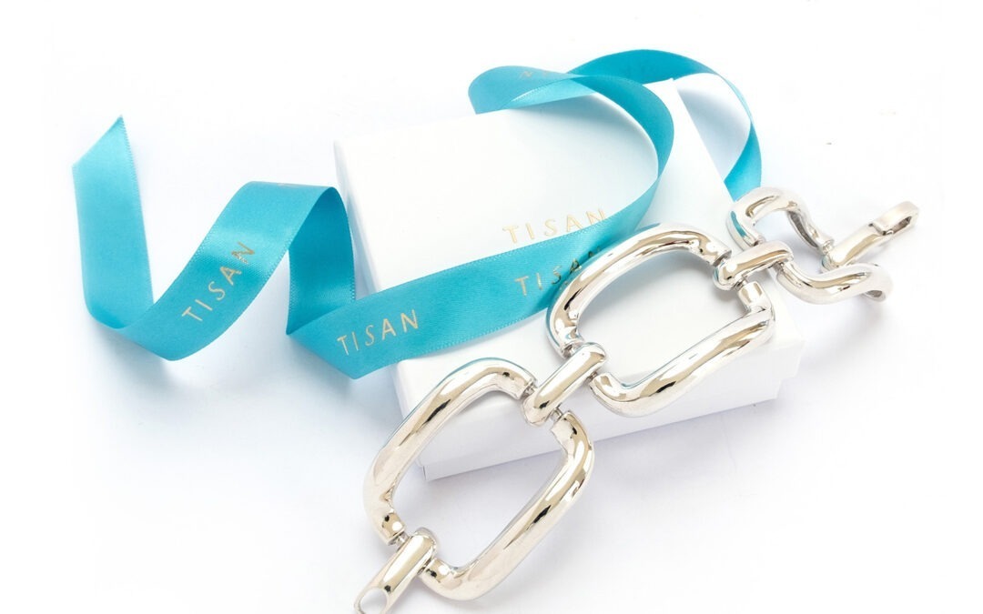
This Tuesday we had the first competition of the season. We had 66 entries over all 4 categories covering a wide range of subjects. Images were judged by Darren Pullman. There were 4 images scoring 20 points, Andy B with “Go For It”, Robert B with “Trees In The Mist”, Alastair with “Canada Geese Passing Barns Ness Lighthouse” and Sally H with “Silver Bracelet". Darren, then judged the winning image to be Sally’s “Silver Bracelet”. Congratulations to Sally. Thank you Darren.
As we couldn’t record on the night, should anyone have missed their scores or, if anyone wants a note of them again, just drop me an email. There will be a running scores table available on the club website shortly.
As Darren cast his expert (judge's) eye on our images, and gave us the benefit of his interpretation, I made a few notes of the general comments he made - perhaps these'll help us gain a few more points in future competitions.
Darren often asked himself: 'Is this a successful image ? With regard to monochrome images he thinks 'what am I missing' - by which I think he meant if colour was lacking, what was strong in what's left to make it a successful image ? (Shades, lines, composition, story, or something else?)
He did make remarks about some basic quality issues - checking the image size submitted such that the size did a disservice to his ability to judge. Also focus, bright parts, distracting complexity especially around the edges and corners, stand out quality, composition balance between brights & darks, and the choice about what the image is actually about.
I'm not sure Intentional Camera Movement was quite Darren's 'thing' but he did make some comments that such images still needed to show some elements of a successful photo - light, colour, brightspots, lens flare, points of interest, and so on. He did seem to enjoy being intrigued and challenged as to what it was he was looking at.
As usual, it struck me that the title given to a submitted image assumes a disproportionate importance when judged - it can guide the judge, not always in directions intended; it can even cause some friction and provocation that distracts from the image itself. I know it's not very creative to submit an image with a title such as 'Image 1' but in future I intend to err on the side of a title that's not going to detract from the image. Keep it simple ?